MID-FI PROTOTYPE: FINAL ROUND

This was the first week in which we focused exclusively on our mobile prototype, after having ruled out augmented reality the previous week. We tested a mid-fi prototype on three members of the HCI group, including one designer and two developers. Adam and Derin also started development in tandem using several existing javascript frameworks including angular.js, node.js, mongodb, and ionic. Here’s our rationale for using these frameworks:

  • Angular uses a model view controller capability in tandem with the ionic framework to help with the development and makes passing data to and from the front-end easier.
  • MongoDB facilitates integrating a document-based database with our application.
  • Node lets us create our own server and send data between the back and front end.

CHANGES TESTED IN MID-FI PROTOTYPES:

Jobs

  • Ability to create templates from previous jobs
  • Separated Jobs into three sections: My jobs, Other jobs, Templates

Notes

  • Shortcut for creating notes from a top-level “Add” button in the menu
  • Created a “Recently Used” section

Checklists

  • Ability to mark an item as complete

Clean room checks

  • When users mark a job as complete, check the workspace to see if they left any tools behind and send a notification if the system detects something

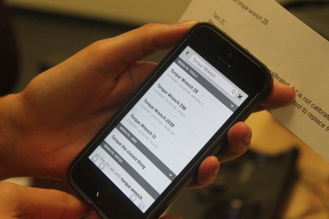
 (Screenshot of the revamped Jobs page, which includes My Jobs, All Jobs in Progress, and Job Templates sections)

mid-fi1

(Screenshot of the screen users saw after selecting a job from the list)

mid-fi2


KEY TAKEAWAYS:

  • Clarify that the search function can be used to find tools – one participant indicated that he did not use the search bar to find tools because he thought it was only for searching high-level menu items (e.g., Jobs + Notes )
  • Clarify how the back button works – participants were unsure whether pressing the back button returns them to screen they were previously on. In the version we tested, pressing the button returned them to the top-level menu item they were previously on (eg, Jobs, Notes). In the latest version, pressing the button will take them to the screen they were previously on only within a top-level section.
  • Clarify how checkboxes work – participants were unsure what marking a job as complete does. Moreover, one participant incorrectly guessed that marking a note as complete would make the associated job complete.
  • Make warnings more actionable – instead of simply telling users during a clean room check that they left a tool behind, indicate the tool’s current location and where it belongs.
  • Include more feedback and affordances – several examples emerged from our user tests.
    • EX 1: a participant wanted confirmation that marking a job as complete notified participants of his work progress.
    • EX 2: participants wanted confirmation that jobs were automatically saved after they created them.
    • EX 3: participants didn’t realize that they could click a tool to see an expanded set of info about it.

We’re taking a break from user testing this Friday because of the holidays (and the World Cup quarterfinals.. ) but plan to test our first hi-fi prototype next week on target users. Stay tuned!


Mid-fidelity Progress

This past week, we were able to user-test on two folks from the HCI design group as well as two developers. One of each tested our mobile display, and one of each tested our augmented reality prototype.

Key med-fi mobile feedback

  • Alerts should be made more clear and useful. Confusion over the alerts—perhaps due to how they were visually displayed, individuals did not understand the importance or use of alerts.
  • Tools should be grouped by location. Multiple individuals voiced that they were hoping the system would group tools by location so they are easy to gather (The system did not do this in this prototype due to the quantity of tools they needed, but it’s an easy upgrade for our next iteration)
  • Shortcuts are key. Participants voiced dissatisfaction if they felt they had to go through too many clicks for information.

Image

Key augmented reality feedback

  • Specific voice commands are difficult to remember. Participants still leaned on natural language in order to navigate. They also voiced confusion over what different terms did with the system and how terms were different.
  • Wanted more information to be displayed at a time (felt they had do a lot of navigation through the system to get to any information), but…
  • …they also didn’t like how their vision was obscured when more information was shown

Image

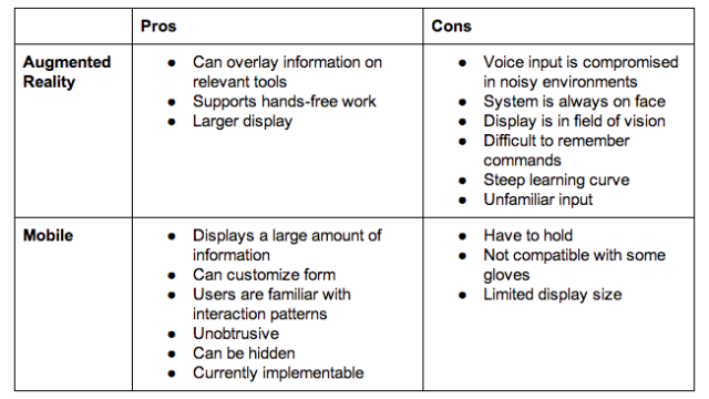
We ended up making a table of pros/cons on augmented reality and mobile in order to narrow down our scope as we move closer to the high fidelity prototypes.

Image

Last week, we also brought forms to the arc jet facility in order to gain understanding of what kind of form might work and allow some of our team to see the arc jet for the first time. From the observation and conversations at the facility, the main takeaway was that the form should be customizable. Some technicians expressed that the wristband would work, or that they’d want to put it on their belt, and it really just came down to working preferences.

We decided to proceed with designing and developing for a mobile device that allows different types of form use (perhaps it can snap to a wristband or waist belt, or use a magnet to adhere to a work station). We are currently developing another iteration of the mobile version for testing later this week.

More Prototyping, with Augmented Reality

Over the previous two weeks, we continued with our prototyping efforts.

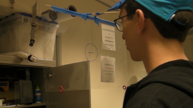
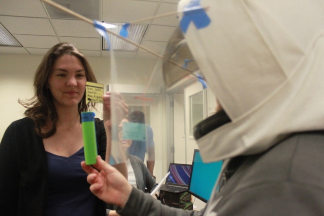
We first continued iterating on our first week’s prototypes. We made another iteration of the paper watch and wrist mount devices. Additionally, we began exploring the augmented reality form, which posed to be a difficult prototyping challenge. In order to prototype augmented reality, we created headgear that hangs a piece of transparency paper in-front of the user. This allows us to change these “screens” and they would appear someones field of vision. Additionally, we created “dialog” that allow us to augment the real world. For example, little boxes that can provide additional information above a tool.

 Image

We tested these concepts with 4 of our target users, including a lab scientists, test lab engineers, and a maintenance worker. They provided very useful feedback that we were able to incorporate into our next round of testing. Most importantly, we discovered that a wrist mounted device is no ideal. We received lots of feedback that a device mounted on the arm would get in the way of their work, however something hip mounted or necklace type device could work.

Image

Next, we narrowed our focus do to two different prototypes, our first mid-fidelity mobile display, and another augmented reality low fidelity display. We were able to test these with four individuals in the HCI group. Here is a summary of our finding that we will use to guide our next iteration of designing and tests:

  • Finding things in the system is difficult. Information that individuals were seeking was not located where they expected it, and they found the navigation system cumbersome.
  • Input/Output systems are suboptimal. The augmented reality prototype used voice controls/commands. Our testers found this to be very unnatural and had difficulty interacting with the system through voice.
  • Status information is not clear. Similar to findings in previous weeks, the status information we are providing to users was not clear. We are still narrowing down exactly the information they want and the best way to display it to them.
  • The concept of bins is confusing. We are using “bins”, which are basically collections of tools and notes to organize our system. However, this did not fit with users mental model of performing tasks.

With these findings from the previous two weeks, we are beginning to mid-fidelity prototyping and will continue to design and iterate new solutions. We plan to soon narrow down our focus to one form, and begin higher fidelity design and development.

First round of prototypes and user tests

IMG_2184IMG_2169 During our second week onsite at NASA Ames Research Center, we developed our first low-fidelity prototypes and designed a series of tasks to test out these concepts with participants.  Using foam shapes and different rooms, we created a “workspace” to represent an ArcJet environment. For example, during one of the tasks, a participant needs to find faulty bolts on the ArcJet, keep track of their locations, find replacement bolts and tools needed, and finally, replace the faulty bolts.

We decided to focus on two forms in which our system, HeliOS, might exist: a wrist watch or an armband device. Though we also brainstormed a iPad app and augmented reality googles as possible form factors, we decided that the wrist form would be a starting place. iPad has many patterns that we could follow, but they might be too limiting, but augmented reality had almost none.

IMG_2223

IMG_2202During the user test, we split into different roles. One person served as the moderator/narrator, while another person was the Wizard of Oz “machine” who changed the screens. One person took notes with pen and paper, and another person recorded the tests in their entirely. Lastly, someone took still images of the tests for documentation purposes.

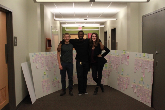
After the tests, our group debriefed on the results and wrote down a list of changes for the next iteration. We also pasted all of our screens onto paper and annotated our observations and changes for future reference. Here are a few major findings from our first user test:

  1. Navigation is unnecessary: people tend to be pretty familiar with their own work facilities, so there is no need to have step-by-step navigation to help someone find their tool. Instead, we need to name our “zones” in a way that helps individuals know exactly where to search for their tools.
  2. Bucketing for bulk actions: we needed to build in a functionality for a group of tools to be associated with each other for bulk actions.
  3. Make information more contextually available: we noticed that participants didn’t always know where to seek the information they needed, even when they had previously documented that information for themselves. This helped us to realize an opportunity to provide a notification, in context, that can direct them to the relevant information.
  4. Make notifications more noticeable: participants didn’t notice all of the notifications that appeared on their screen, which might’ve been due to the nature of the paper prototype. However, we realized that there are varying levels of importance for notifications.
  5. Provide “home location” for tools: while our system provided information about where a tool can be found, it didn’t tell users where a tool could be placed, if they wanted to perform a clean-up action.

Wristband_v1 Watch_v1

With our findings from the first prototypes and user tests, we are now creating the next iteration of paper prototypes. We have refined our user tests to include a collaboration component and removed the navigation functionality. We have also started making an augmented reality prototype, which we will talk more about next week.

Summer Session Kickoff & User Tests Coming Up!

We arrived in Mountain View, California last Tuesday, on May 20th 2014, and so began the summer session. Last week, we gave our spring research presentation to our clients and the rest of the HCI team here at Ames. The presentation was not only informative to the rest of the team, but it also served as time for us to further think about our visions and hear new questions and thoughts about our project. It was refreshing and useful to hear ideas that we had not thought of. After the presentation, we sat down with Matt and Alex and began discussing the direction our prototypes should head. We all agreed on focusing more on the locating and tracking of tools, as opposed to the procedure side of the problem.

We decided on this due to the fact that we did not want this project to be repetitive. Previous NASA teams focused on the procedure execution and improving the way NASA employees interacted with procedures. Through discussions and brainstorming sessions, we have decided to focus more on notifications, sending information to objects, locating tools, and searching for tools. Through numerous brainstorming sessions, we thought of different ways to implement our system. One of them being zones, which I will explain in the next paragraph. By the end of last week, we had planned out our projected summer schedule, laid out our summer report table of contents, and brainstormed three new visions, which you can read a little more about below. 

Image

Image


Image

Earlier this week, we had peer critiques where our team, and two others, shared our new visions, explained our thought processes, and elicited constructive feedback from each other. Now, zones were an idea we had, where individuals (using augmented reality) could perform a specific gesture, create an imaginary zone around a group of tools, or place their tools within that zone. However, this week, we finalized the zone idea and made it so that zones are not arbitrarily created. In addition, a zone can be the size of a workspace, and each zone has a unique name, for example “Lisa’s Workstation.” This week, in addition to finalizing zones, we created our user experience goals, began and finished designing our first user test, and decided on testing two different implementations of our system on Friday May 20th.

Our user experience goals serve as a reminder to keep us thinking about what is most important to NASA engineers and astronauts. They are guidelines we should have at the back of our heads as we iterate and ideate prototype designs. These goals are: support existing work practices, account for the distrust of automation, adapt to conditions of the environment, mitigate physical obtrusion (it shouldn’t get in the way while individuals are working), and require minimal cognitive effort. 

After even more brainstorming, we decided to come in the next day with screens of how each of us thought the system would work. During that meeting, we noticed that some of us had designed for a bigger phone size screen, while the rest of us designed for a large watch / wrist sized display. We then realized (and our mentors Jenna and Jason might’ve hinted on this as well) that we as a team are “thinkers.” Rather than continue thinking, we decided to just stop obsessing about the little details and began making some quick prototypes. The team broke up into two groups, half of us worked on a iPhone sized prototype, while the other half worked on the smaller display. We want to test both implementations on users and gather enough feedback to allow us to focus even more on the implementation we want to go with. Next week, we decided on testing another two implementations: an iPad display and possibly an augmented reality display.  

For our user test, we created a scenario that puts the users in the shoes of a technician working in the Arcjet Test Lab. A part of the prompt is, “Today, your job is to replace any faulty bolts on the ArcJet’s cooling tubes. This is a critical task since the bolts hold different components of the ArcJet tubes together.” Once found, participants will use our system to add a note for later reference to the faulty bolts, search for the necessary tool, receive notifications from our system, and locate and gather the necessary tools as prep for the next procedure. 


Vision Storyboards

Since last week, we have worked out the details of our five visions a bit more. Maggie has also created some very nice story boards for them.

First up is Auto Detecting Work Stations:

Screen Shot 2014-04-25 at 1.09.30 PM

Next we have Digital Labeling:

Screen Shot 2014-04-25 at 1.09.35 PM

Followed by Noisy Tools:

Screen Shot 2014-04-25 at 1.09.40 PM

We also have a Wristband Display:

Screen Shot 2014-04-25 at 1.09.47 PM

And finally Tool-Aware Procedures:

Screen Shot 2014-04-25 at 1.09.53 PM

Narrowing our list of visions

This week, we combed through our ideas to agree on the most promising themes. To come up with these themes, each of us chose our 3-5 favorite ideas, and then we grouped similar ones together. We arrived at the following 5 themes and then constructed preliminary visions to show possible real-world applications. None of the solutions are finalized yet, but we now have a narrower list of ideas to explore in depth over the next few weeks.

  1. Extracting and displaying key info from procedures
  2. Displaying key info from procedures on a portable device
  3. Associating tools with related procedure steps
  4. Showing status information on tools
  5. Auto-detecting tool locations/statuses

Visions

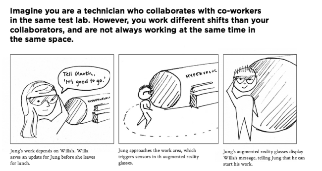
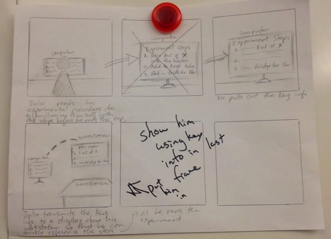
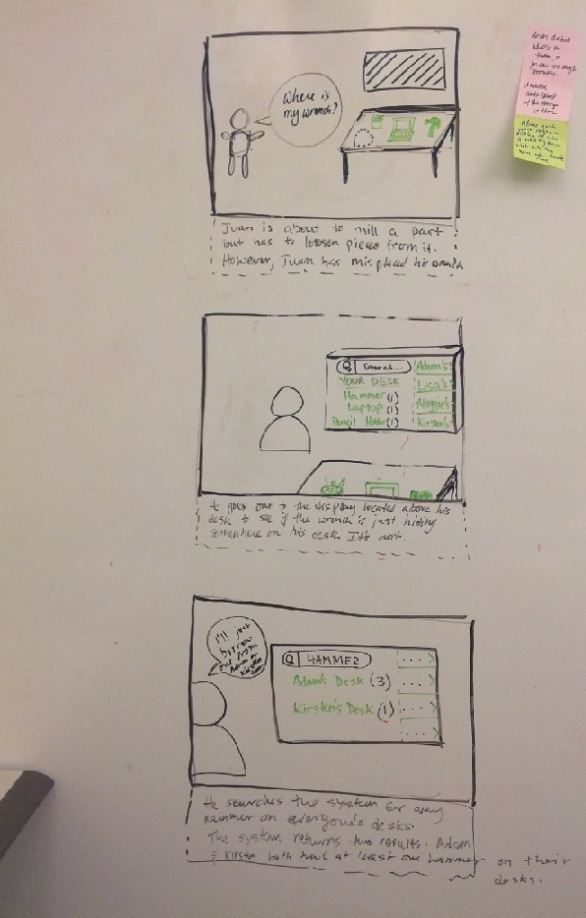
1. Storyboard showing a system that can extract and display key info from a procedure. Below, the system extracts the key info, and then sends it to a display above Julio’s workstation for quick reference.

Image

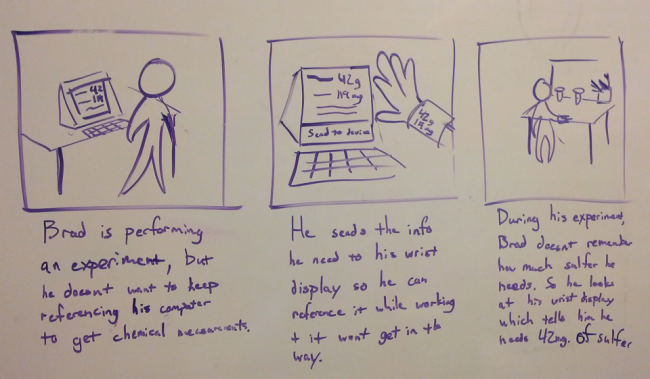
2. Storyboard showing a system that can extract and display key info from a procedure on a portable device such as a wrist display. Below, Brad transfers key experimental specs from his computer to his wrist display for quick reference while he runs the experiment.

Image

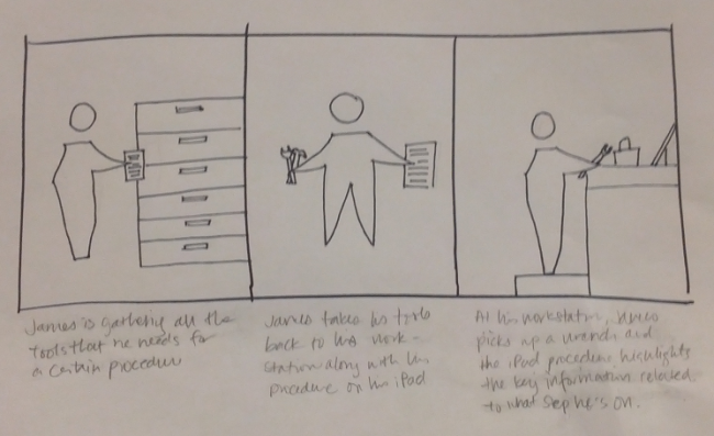
3. Storyboard showing a system that can associate tools with related procedure steps. Below, the digital procedure document shows the key information related to a tool depending on which step James is on.

Image

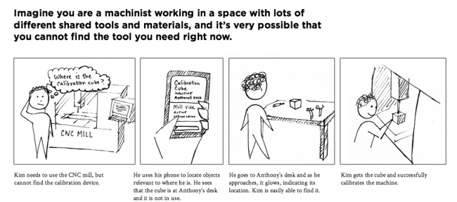
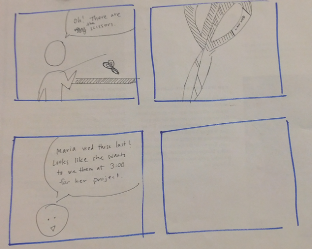
4. Storyboard showing a system that displays status information on tools. Below, the worker can see who used the scissors last and who will use them next.

Image

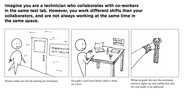
5. Storyboard showing a system that can auto-detect tool locations/statuses. Below, the workstations automatically detect which tools each one contains or who’s currently using the tools that are normally stored at a specific workstation. A display above each workstation will show this information, as well as tool statuses across other people’s workstations.

Image

Next week, we will continue to solidify our solutions by considering functionality, use cases, and other characteristics.


Brainstorming

This week we moved into a new phase of the project. We have switched out of research mode and started to brainstorm.

We started out with a team brainstorming session and we just dumped out as many ideas as we could.

Image

Here are some of the ideas that we had:

  • Key information is automatically extracted from documentation and sent to a portable device
  • Sticker with digital display on tools, that provides procedure step relevant to that tool
  • A robot that knows the location of every tool and what procedures they are associated with (it looks like EVE from WALL-E)
  • Dots on tools that will glow light/dark depending on how far away they are supposed to be
  • A tablet that learns what you are doing and which tools are needed for each process and tell you when you don’t have them.
  • Tools can talk to each other and pass data between themselves (Why though, we don’t know)
  • Watch-like wristband that can hold small pieces of information and share it easily to coworkers

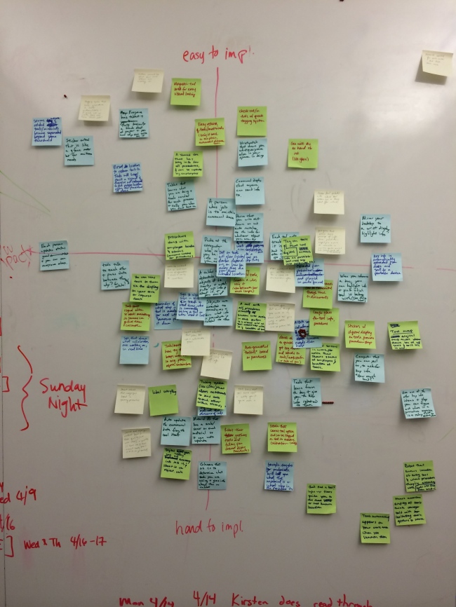
We then mapped these ideas onto a matrix of implementation difficulty vs. impact:

Image

After doing this we felt like we needed to get some crazier ideas so we used a new brainstorming game. We picked a random word and had to come up with ideas that were related to the chosen word. Here are some of the ideas we came up with:

Antiquated

  • Write on sticky notes, and attach them to objects
  • Manually go through and label every object and color code them
  • Everyone wears top hats that display what procedure step they are on

Reciprocity

  • Someone is responsible for each group of tools and must look over them
  • Instead of placing a tool back into the “right” place when finished with it, you drop it off to the next person who will need it

words

Although these ideas are a bit strange an unrealistic they got us thinking about other solutions and ideas to incorporate into the design.

We finished off the week with a small body storming session. We came up with a few scenarios and solutions for them. One interesting idea was a glove that connected with procedure documents on the computer as well as tools. This would allow someone to extract info from their workstation and associate it with a specific tool. Then the glove could detect when that tool was being held and then display the information that pertains to that tool/procedure step.

bodystorm

Next week we plan to come up with many more ideas, and pick potentials areas to explore a more deeply and construct initial visions around them.

Consolidations part 2 + Affinity + Findings

Consolidations

This week, we also finished consolidating the sequences.

Image

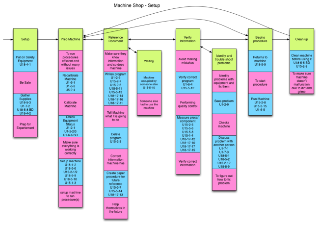
Above: machine shop setup

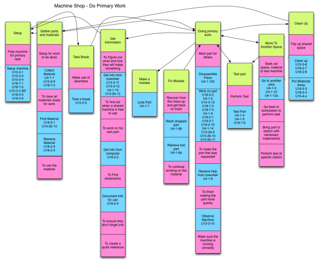
Image

Above: machine shop doing primary work

Note: Upon uploading, we noticed that breakdowns are not marked and will be updating those asap.

 Affinity

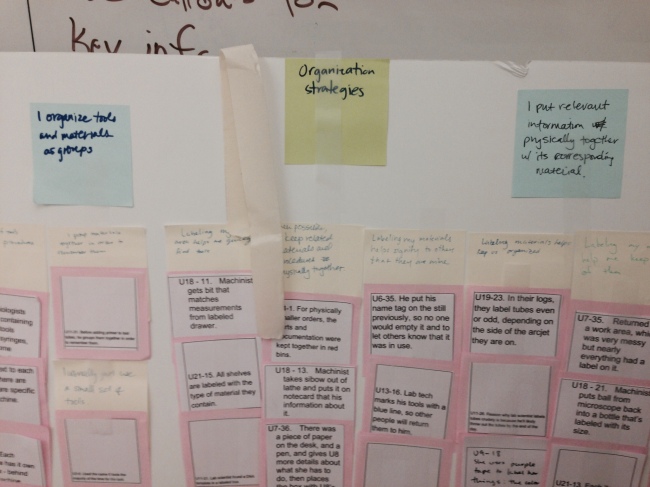
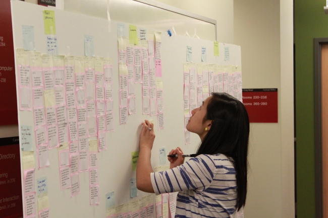
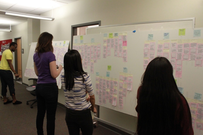
We also continued with our affinity and grouped them into higher categories. Some of the second level examples include:

  • Experience helps me perform my job more efficiently
  • Status information is not always a good indicator.
  • Labeling shared areas and materials helps pass information more efficiently between people.
  • There is a lot of information I need to hold in my head.

These then got grouped into higher level categories, such as organization strategies or safety.

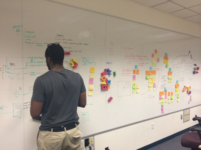
Image

Image

Image


Image

Key Observations from domains

Medical

  • Tool organization and tracking are done manually

  • Standardizing procedures is challenging because of unique physician and patient needs

  • Collaboration breakdowns are caused by poor coordination and inaccurate system information

  • Technological solutions are not always appropriate

Lab scientist

  • Communal tools and spaces need constant coordination

  • Frequently need to easily access small pieces of information

  • Cleanup and documentation for one procedure is prep for a new one

  • Information is associated with physical objects

Machine shop

  • Work Process Differ Based on Preference and Experience

  • Shop Status Information is Necessary and Difficult to Gather

  • Information is Physically Associated with Materials it Pertains To

  • Multitasking and Nested Procedures Occur Frequently

Test lab

  • Documents are inadequate for quick reference during procedures

  • People are often unprepared to collaborate, resulting in breakdowns

  • Short distance collaboration creates inefficiencies

  • Procedure processes are adapted to minimize cognitive load


Findings

We’ve consolidated all of these various notes and observations into our three key findings/insights:

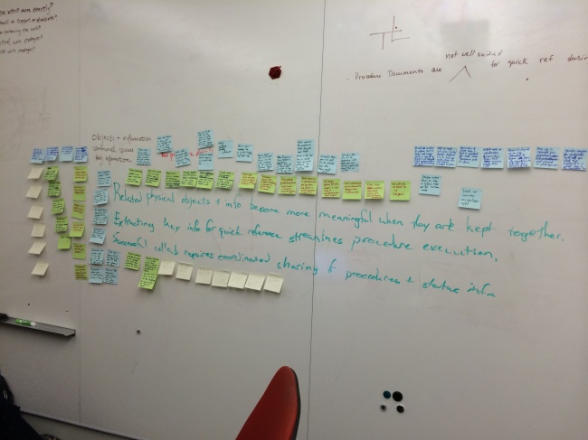
  1. Related physical objects and information become more meaningful when they are kept together.
  2. Extracting key information for quick reference streamlines procedure execution.
  3. Successful collaboration requires coordinated sharing of procedures and status information.


Consolidations Part 1

This week marked the completion of consolidating sequence and flow models for each of the analogous domains: science labs, machine shops, test labs, and medical. We have also completed the lowest level of affinity diagraming but still need to create the higher level affinity notes.

Within each domain area, we took a gathered some preliminary insights.


Test labs

Test Lab Flow


  1. Almost all breakdowns occurred between collaboration and tester
  2. Numerous reference providers
  3. People dependencies waste time
  4. Batching of tasks


Machine shops

Flow


  1. Coordinating with client creates a lot of discrepancies/issues
  2. Searching for a tool can help you figure out how to solve problem
  3. Batching of tasks
  4. Distrust of technology

Lab scientists

lab-scientist-consolidated-flow

  1. Not carrying around procedure documents because they get in the way
  2. If communal things aren’t updated, the whole system of shared materials breaks down
  3. Transferring results between different stations and systems
  4. Reference provider entity shared across many roles
  5. They carry around the most relevant pieces of information from their procedures


We have also examined the consolidated data to uncover some additional preliminary insights. We began by breaking down each procedure into a few abstracted steps and aggregated breakdowns across both consolidated sequence and flow models:

  1. Gather tool and material: 12
  2. Gather information: 7
  3. Run procedure: 10
  4. Verify: 4
  5. Collaboration – sharing: 11
  6. Collaboration – work: 2
  7. Clean up: 3
  8. Documentation: 5

Our next steps are to gather insights from our affinity diagrams, find key observations from consolidated sequence models, and look at everything across the domains with the goal of generating our three key insights.